How to Convert Midjourney Images to 3D models using this FREE AI

How to Convert Midjourney Images to 3D models using this FREE AI

How to convert Midjourney AI images to 3D models using this FREE AI

Hi, guys. This is Tridib, and I’m thrilled to share a remarkable platform that brought me immense joy. As fellow AI explorers, we always strive to support one another by sharing new and innovative software or app platforms. Together, we can enhance the world of AI and elevate the quality of AI imagery. While everyone is busy creating incredible videos using runway ML and Midjourney or stable deficient images, I ventured into something slightly different. Allow me to share my experience.

Midjourney to 3D Model
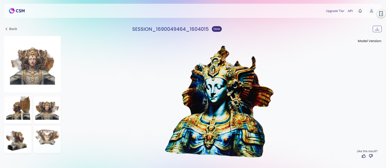
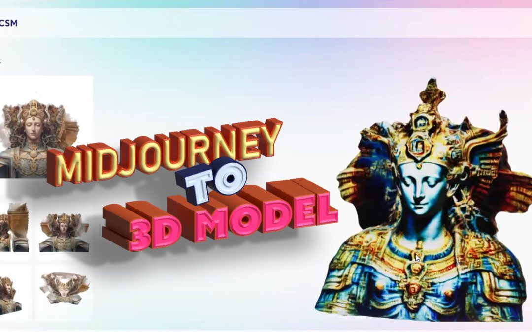
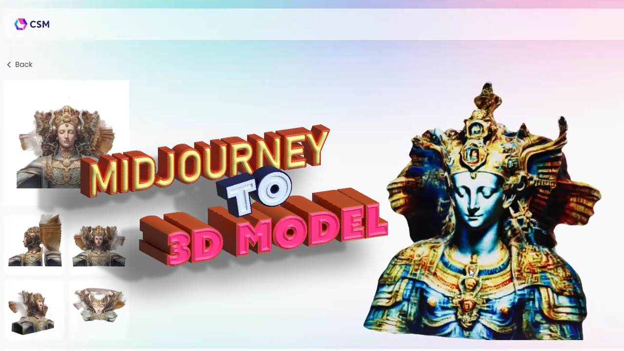
I used an image-to-3D platform called CSM3D or CSM.ai to convert my Leonardo, Midjourney, and Stable Diffusion images into impressive 3D models. While the platform is still in its early stages and lacks some refinement, I am confident that with continued work, it will improve significantly. I am quite pleased with the current output. In the past, during Midjourney’s initial phase, I created various Midjourney images, including ones I shared on AI IS God. Additionally, I experimented with creating 3D representations of melting food and carved a rhino from a marble piece.
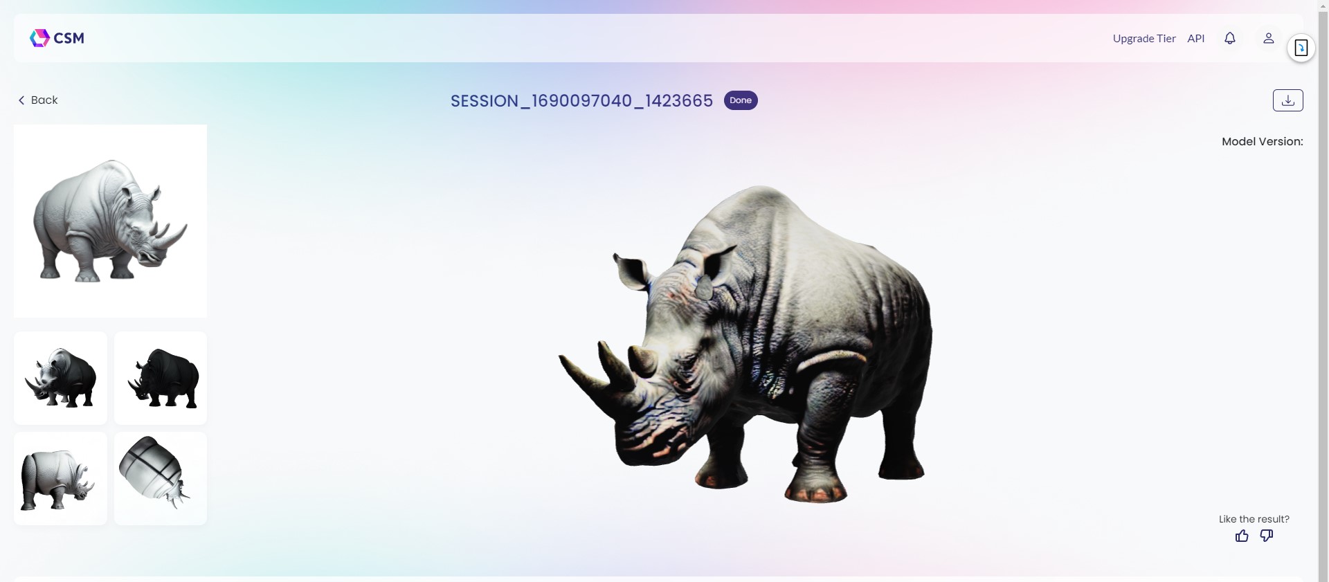
Within a few hours of using this platform, you can train and carve out images. It may take around 1 to 2 hours to achieve the desired result. Carving out, rather than building a 3D model, creates a 3D representation by enveloping the image in a cutout shape while preserving the contours. While the outcome may vary, sometimes it produces excellent results. In case you encounter any issues, simply go to the “Image to 3D” section and upload your image. Alternatively, you can generate the 3D model through their Discord platform. For example, I uploaded an image of a rhino and it converted into a detailed 3D representation.
midjourney-to3d-002
If you examine the situation, it becomes evident that certain elements are unnecessary in the 3D model. Consequently, a 3D rhino was constructed based on the original rhino by removing it from the main exterior and building it up within the 3D model. Similarly, the same approach was taken with this image – the entire model was extracted from the background.
midjourney to 3D model 001

I’m extremely pleased with the contour and texture of the work they’ve done. It’s not simply a matter of scaling, but rather a meticulous modeling process based on diffusion noise. While there are some aspects that remain unclear to me, like the rearrangement of objects and slight color inconsistencies, I’m amazed that it required minimal effort on my part. I only had to upload the image and they took care of the rest. The level of detail in the rhino is particularly impressive, although there are some minor flaws such as a misplaced ear. Despite these imperfections, they managed to extract the core model flawlessly. However, I must admit that the outcome of the image fed to the engine was a disappointment. The burned bread looks out of place, and I suspect it might be due to limitations with vector-based images. Although this aspect didn’t work for me, the other two elements, especially the depth map, were truly shocking in their quality. I’m confident that if the platform addresses its current shortcomings, it could be a game changer.

That’s all for now, have a wonderful weekend!

Get access to 100s of such interesting Generative AI content absolutely FREE by subscribing to this website https://learnwithtridib.com

To experience the real stuff, where all these amazing things happen Live, follow and watch all the videos at https://youtube.com/c/learnwithtridib.

If you are new to the channel do not forget to subscribe to the channel and hit the bell icon so that you can get all the upcoming updates easily.

Another easy part if to subscribe to our newsletter and stay updated:

Share this:
How you can train ChatGPT to write prompts for Midjourney

How you can train ChatGPT to write prompts for Midjourney

How you can train ChatGPT to write prompts for Midjourney

Recently, many fellow AI community followers and AI artists had asked me on Linkedin and AI art discussion forums how could I make Chat GPT command Midjourney with perfect prompts.

Well, the most important thing that you have to do to make ChatGPT help you in creating exact prompting is … make friendship with it. Yes, you heard it right. Not literally friendship as the bot doesn’t have a soul, lolz but make him understand the prompt formula very minutely.

Here is what I did.

Training Chat GPT to prompt for Midjourney

Teach ChatGPT the prompt framework for Midjourney

Step 1: Log in to ChatGPT and then write the following in the prompt space in ChatGPT.

Here’s a Midjourney formula for you to understand.
‘/imagine prompt: [Image we are prompting], [5 descriptive keywords], [Camera type], [Camera lens type], [time of the day], [focal distance], [style of photograph], [by photographer name] –ar x:y Reply ‘yes’ if you understood the formula.

 You can replace the Camera type with Art or illustration type. Instead of Camera lens type, you can use brush type, you can skip the time of the day, and other stuff based on the prompt you want to achieve.

Training ChatGPT to write prompt for Midjourney,Midjourney prompts with ChatGPT,Training ChatGPT,Midjourney prompts,AI Art

This is what you will get as a reply.

“Yes, I understood the formula. It appears to be a formula for imagining a photograph or image, which includes a prompt for the subject matter, descriptive keywords, camera and lens type, time of day, focal distance, style of photograph, and the photographer’s name. The “ar x:y” at the end might refer to the aspect ratio, indicating the dimensions of the image.”

Just imagine how intelligent it is that it understood the “ar” as an aspect ratio. Yes, I am not cooking up the story, hence I have added the screenshot here.

But one thing, as more and more you will use these prompt snippets, ChatGPT will start replying to you in simpler terms like “Yes, I understood the formula” and will wait for you to ask the next question/ step.

After Understanding and confirming that the ChatGPT understood my prompt, I wrote the following to it:

“So since you have understood the prompt formula, kindly write me 5 Midjourney prompts of portals opening to a new futuristic cities”


Training ChatGPT to write prompt for Midjourney,Midjourney prompts with ChatGPT,Training ChatGPT,Midjourney prompts,AI Art

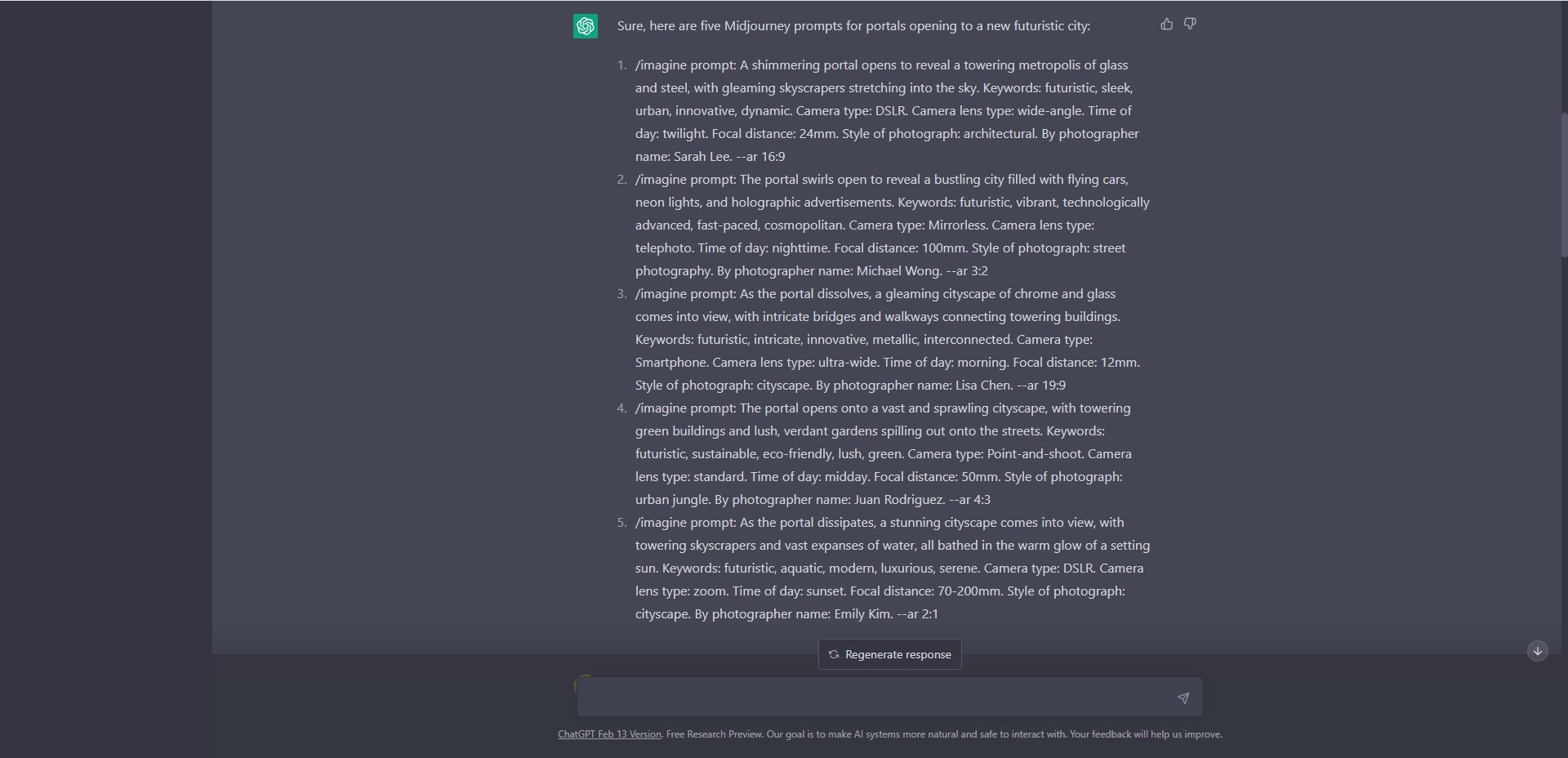
And, these are what it generated:

Sure, here are five Midjourney prompts for portals opening to a new futuristic city:

  1. /imagine prompt: A shimmering portal opens to reveal a towering metropolis of glass and steel, with gleaming skyscrapers stretching into the sky. Keywords: futuristic, sleek, urban, innovative, dynamic. Camera type: DSLR. Camera lens type: wide-angle. Time of day: twilight. Focal distance: 24mm. Style of photograph: architectural. By photographer name: Sarah Lee. –ar 16:9
  2. /imagine prompt: The portal swirls open to reveal a bustling city filled with flying cars, neon lights, and holographic advertisements. Keywords: futuristic, vibrant, technologically advanced, fast-paced, cosmopolitan. Camera type: Mirrorless. Camera lens type: telephoto. Time of day: nighttime. Focal distance: 100mm. Style of photograph: street photography. By photographer name: Michael Wong. –ar 3:2
  3. /imagine prompt: As the portal dissolves, a gleaming cityscape of chrome and glass comes into view, with intricate bridges and walkways connecting towering buildings. Keywords: futuristic, intricate, innovative, metallic, interconnected. Camera type: Smartphone. Camera lens type: ultra-wide. Time of day: morning. Focal distance: 12mm. Style of photograph: cityscape. By photographer name: Lisa Chen. –ar 19:9
  4. /imagine prompt: The portal opens onto a vast and sprawling cityscape, with towering green buildings and lush, verdant gardens spilling out onto the streets. Keywords: futuristic, sustainable, eco-friendly, lush, green. Camera type: Point-and-shoot. Camera lens type: standard. Time of day: midday. Focal distance: 50mm. Style of photograph: urban jungle. By photographer name: Juan Rodriguez. –ar 4:3
  5. /imagine prompt: As the portal dissipates, a stunning cityscape comes into view, with towering skyscrapers and vast expanses of water, all bathed in the warm glow of a setting sun. Keywords: futuristic, aquatic, modern, luxurious, serene. Camera type: DSLR. Camera lens type: zoom. Time of day: sunset. Focal distance: 70-200mm. Style of photograph: cityscape. By photographer name: Emily Kim. –ar 2:1

Understand one thing, the aspect ratios will be random. Use it or change it as per the version of Midjourney that you are using. 

Training ChatGPT to write prompt for Midjourney,Midjourney prompts with ChatGPT,Training ChatGPT,Midjourney prompts,AI Art
So that’s it guys. Now begin training your ChatGPT to achieve amazing prompting results. If you’re a newcomer and starting to prompt platforms like Midjourney to generate fascinating outcomes, this small tutorial will greatly assist you in achieving extraordinary results. However, remember to customize your teaching approach for each new version of Midjourney.

Conclusion:

In the realm of AI art and its growing community, the question of how to effectively prompt Chat GPT for mid-journey commands has been a topic of great interest. Many have wondered how to establish a connection with this innovative tool in order to unleash its true potential. The key lies in understanding the prompt formula intricately and forging a unique bond with the bot. While it may not possess a soul, the power of friendship, even in a metaphorical sense, can lead to remarkable results. So, embark on this journey of exploration, and let ChatGPT’s command of mid-journey prompts unveil a world of endless artistic possibilities.

Share this:
Understanding the New Version of Midjourney V5 – What’s hit and what’s a miss

Understanding the New Version of Midjourney V5 – What’s hit and what’s a miss

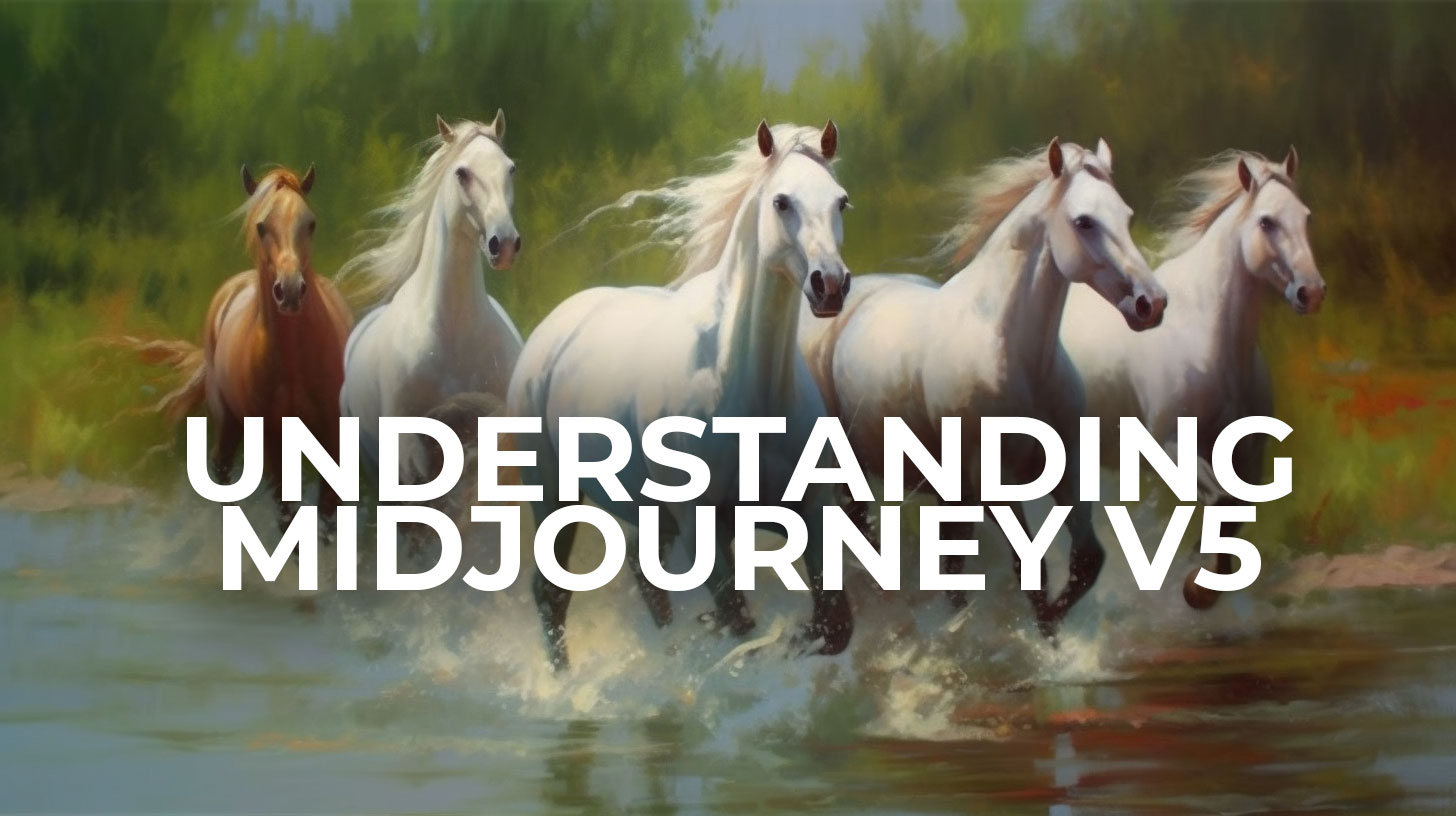
So, Midjourney V5 is the new version of Midjourney that has hooked thousands of creators all over the globe. Artists, and designers who have been using V4 for the past few months have welcomed V5 with open hands ( or is it not?). There’s a little bit of doubt factor that has arisen, which I will explain in this Blog.

But before that let me first let you know what has worked with the new version and what hasn’t.

Midjourney v5,Midjourney,Midjourney V4,What's new in Midjourney V5,Midjourney is more photorealistic in V5,How can I get more artistic renders in Midjourney V5

What Works:

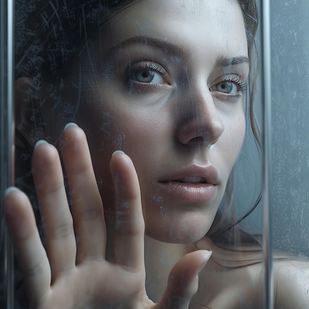
1. Photorealism: The core success of V5 lies in its Photorealism. The images are so real and photorealistic that you will feel that you can even feel the pores of the skins.

Midjourney v5,Midjourney,Midjourney V4,What's new in Midjourney V5,Midjourney is more photorealistic in V5,How can I get more artistic renders in Midjourney V5

2. Hands, Fingers, and Limbs:: Yes, in this version Midjourney did fix the Wobbly fingers, twisted hands, and limbs issues that plagued the earlier versions of Midjourney. A big Shout out to the Midjourney team. Awesome job here.

Midjourney v5,Midjourney,Midjourney V4,What's new in Midjourney V5,Midjourney is more photorealistic in V5,How can I get more artistic renders in Midjourney V5
3. More Cinematic: The V4 first gave us the taste of Cinematic shots and we were awed. But in this version, the quality has gone top-notch, totally next level. Every scene if rendered under cinematic Prompt looks as if came right out of the movie. And the best part you can manipulate the extent of Cinematic output in the combination of the Directors’ style name and genre.
Midjourney v5,Midjourney,Midjourney V4,What's new in Midjourney V5,Midjourney is more photorealistic in V5,How can I get more artistic renders in Midjourney V5

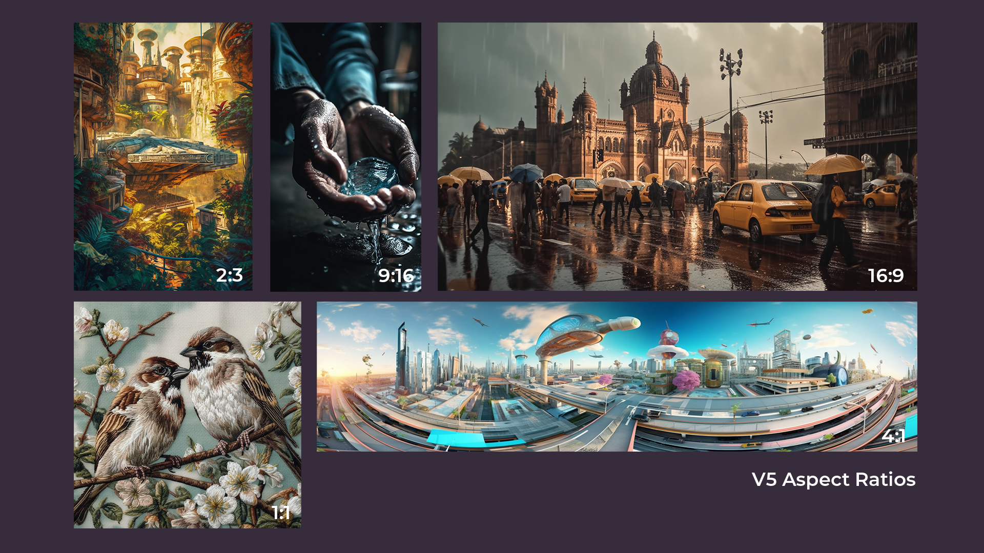
4. Aspect Ratio: In V4 we struggled for a higher aspect ratio for most of the time, later they supported 1:2 and 2:1 and later they lift the bar for 16:9 as well as 9:16, but in V5 we can use almost any aspect ratio and even go till 4:1, 5:1 ratios. That means even cinematic renditions of images, like anamorphic frame formats ( ratios 2.39:1 ) which are used in cinematic creations, are now possible in V5. –ar 5:1

Midjourney v5,Midjourney,Midjourney V4,What's new in Midjourney V5,Midjourney is more photorealistic in V5,How can I get more artistic renders in Midjourney V5

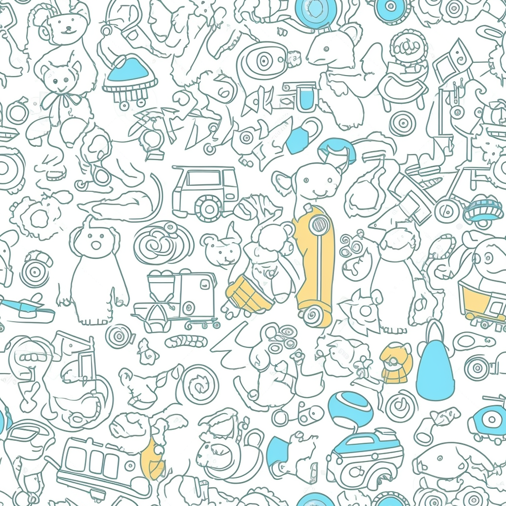
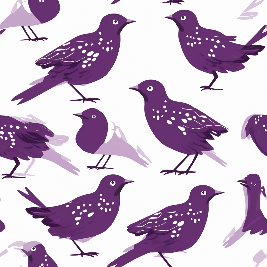
5. Tile: In V4 they had removed the possibility of getting Tiled patterns for some reason that was available in the older version of Midjourney V3. Now with this version V5 alpha version, they have brought in the Tile pattern again. –tile

5. Tile: In V4 they had removed the possibility of getting Tiled patterns for some reason that was available in the older version of Midjourney V3. Now with this version V5 alpha version, they have brought in the Tile pattern again. –tile

Midjourney v5,Midjourney,Midjourney V4,What's new in Midjourney V5,Midjourney is more photorealistic in V5,How can I get more artistic renders in Midjourney V5

Image Weights Now you can have full control of image weights that were earlier removed from V4 –iw 0 to 2

v5 is “less opinionated” (They did mention this in the official Release Document) What does that mean? This means that in V4 we had to only write smaller text prompts, and Midjourney used to do the heavy lifting.But in V5, we have to write more detailed prompts that give more details to Midjourney about what the lighting, style, or mood of the output image should look like. If we do not put anything, the default style will be Photorealism.
However, there is more room for control of the output generation through extensive text prompts. That means, there is more bond between the input text and the output image.

What Needs Improvement:

Midjourney has already released the statement that V5 is still in the Alpha state and is open to further improvements. However, in the current state, many creators feel that the way they used to prompt craft in V4 is not working the same way in V4.

Many have trained Chat GPT 3.5 to create Prompt for Midjourney V4 but they are not working in the current version. We have noticed that V5 as a platform is extremely plain Jane and if NOT prompted will create Photo realistic images by default. If we want it to generate artistic images or if we want more creative freedom, then we have to train it with extremely detailed prompts. This is one of the new challenges which creators have to face who have been suitably trained with version 4 of Midjourney.

The next big thing where V5 still lacks is Typography. Midjourney V5 still rolls out Garbled Texts when the character is more than one in a word. While, Adobe Firefly has already claimed to address the issue and they are the first in the line, we users of Midjourney have to wait and watch how fast Midjourney can role out the Typography support in their platform.

Will it be V5a or V5b or a complete new version of Midjourney, only time can tell. Till then we creators have to keep our fingers crossed. Well, did I already tell you that the crossed fingers have already been addressed by Midjourney in V5 version.

Share this:
How to ask the right questions confidently to get the right answer- UX research [Step-by-Step]

How to ask the right questions confidently to get the right answer- UX research [Step-by-Step]

My students as well as my UX/ UI team often ask me this question so what’s the purpose of asking the right questions we struggle we really struggle to ask the right question we don’t know what to ask when we are doing an interview so here in this particular video I am going to give you an exact way an exact pattern or exact process how you can ask the right question to your interviewee and these specific types of questions will reveal a lot about that person as well as it will really aid in your goal setting for your particular app or service or the website that you are going to create even asking the right questions can help you create the right product for your target group so first let us understand why asking the right question or asking the question is essential.

First, the most important thing is why we ask the right question. It helps us understand what people need, and what are their motivations rather than what we think they might be needing. Many times before even asking the questions we are biased that they might be asking for this, they might need this particular thing but in actual case, you will see they might need something else so asking the right question or asking questions is very important to understand what your end customer needs rather than what you think that they might be needing. 

Second, to get rid of all the biases that we have. We have a lot of biases we have cognitive biases like self-serving biases and there are various biases I have covered the biases in a sec separate video altogether sunk cost fallacy bias, primacy bias and there are so many of them. You can go and check my previous video on biases where I have clearly explained what are the different types of biases that cloud our decision-making process so asking the right questions also actually minimizes the bias that we have in our mind.

Third,  a particular part of the why we need to ask the right question or why we need to ask questions.  Many times there are situations or information that we know that we don’t know but asking the right question or asking question helps you understand that you don’t even know that you don’t know a particular thing. It is very strange, right? Sometimes we know that we don’t know particular stuff but sometimes we don’t even know that we don’t need or we don’t know particular stuff questions help you in solving that thing questions helps you in understanding that okay you don’t know that you don’t know this very strange right but it is extremely important also many times we have seen that asking questions actually helps in understanding a pattern of usage of a particular user what are the different types of step-by-step things that this particular user does,  what a particular user does from the morning till the end of the day a pattern your regular work and life asking questions helps us to unravel that it’s very important which all of us know if you ask more and more questions we can generate more and more ideas. So the first point is, we need to understand users need what they need rather than what we think they need.  The second was very important we have to get rid of the biases that we have.  The third one is that the unknown information the thing that we know that we don’t know but also those things that we don’t know, that we don’t know.

The fourth one is basically understanding a pattern of behavior of the user throughout their packets of work that they do throughout the day or throughout the months of the year and also the last one to generate multiple ideas so asking questions is important in that way.

Next comes, why we should ask the right question, and what helps in asking the right question. Number one we should be asking neutral and non-leading questions in the sense there are many times,  for example, say we are creating a wallet for your client where they can store their different types of currencies they have different types of money we sometimes ask the leading question – “Definitely we will be requiring a chain in the wallet right? and you will also be requiring a small pouch to keep your coins?” those are the leading questions you are pushing your mindset, your understanding, your already known answers which are there in your mind to ask the question to your end client questions should be absolutely neutral without leading questions. The second is that questions have to be absolutely pretty precise. Asking precise questions solves a lot of unnecessary burns and is a waste of time money or effort. Sometimes if you ask unnecessary questions and questions which are not precise then you might lead to something else somewhere else where you don’t want to go so basically you have to be precise if you really want the right answer from your client for your end user ask precise question precision is terrific.

Also, ask people about their habits, and about recent events. If you ask people about historical events what they did say, for example, I will give you one small example if you ask them what they did in the morning they might be able to tell you, if you ask them, “what did you have for breakfast today morning” they might give you the right answer but if you ask them what you usually do or what have you eaten three weeks back in the breakfast in the morning they won’t be able to give you the right answer so recency of events is very important don’t ask for historical data from people where they have to go down the memory lane to understand or to actually recollect what they did and it is not humanly possible also okay be very sensitive about personal matters so when you are asking questions to your interviewee or you are asking questions to respondents or you are asking questions to the clients or anybody be very very sensitive about their personal happenings over their personal life I’ve seen many people have lost their jobs because they have asked extremely insensitive question to their colleagues or to their respondents another thing is that you have to be very clear about the detail that you want in your answer okay the question should be also appropriate to get that detail that you have to acquire with experience so as you ask more and more questions your experience will give you that idea of how much to ask to get the appropriate detail of an answer so this one is very important now we always come to know that there are two types of asking questions one is open-ended questions and the other one is close-ended questions so what is open-ended question and what is close ended equation open-ended equations are those where you expect an answer a detailed answer from the respondent from the interview whom you are asking the question on the other hand close-ended questions are those where you expect that they will either answering yes no or maybe so how to frame an open-ended question always remember this trick open-ended equation starts with what, how, when, why,  and close ended question do you know, did you know, have you done and all those things what kind of party do you enjoy? So what kind of party do you enjoy if a user needs to answer this question say for example you are planning an event or planning a party as such you might be asking them what type of party do you enjoy this cannot be answered with a “yes” “no” or maybe it has to be a detailed answer. Another question might be how do you decide what type of party you want to attend? Again the respondent has to give a proper defining answer say for example the same question we can ask what did you have for breakfast today morning they have to give an answer bacon sunny side up or poach whatever or serious you have to give an answer. It cannot be a “no” “yes” or “maybe”. You can also ask like this instead of asking did you like our website or not you can ask what you felt when you first saw our website or what did you feel when you first saw the website. They have to give an answer explanatory answer but if you are asked did you like our site you are actually leading them to say a yes or no that is again close-ended.

Right, so do you like a particular fruit or do you like bananas if you say those things there will be either yes or no so these are close-ended you are stopping the discussion over there. Open-ended discussion always leads to much more discussion even your next question might arrive from the question that you have open-ended question that you have given if you have asked you might ask this question how did you feel when you first see our e-commerce portal again they have to give an answer so you are understanding the dream so when it is how what when why so all these things has to be they have to give a proper answer either numeric or a textual answer but for questions like did you like the thing or did you go to this place did you drop off from an e-commerce site they will give the answer light like yes no or do you want to go to a party they might give you an answer maybe so this the entire discussion stops there so we have to understand when to ask open-ended questions when to ask close-ended questions many a times when you are doing qualitative questioning qualitative um we are looking for qualitative questioning we do open-ended questions when we want more and more information from the end user but when we are looking for quantitative we are much more focused we ask close ended questions where we might go and get some particular one worded or one numeric some percentage of data from the end user.

So that’s all folks. Hope you have liked this particular video and you are extremely clear about why questioning is important why asking the right question is important and how to do open-ended and close-ended questions if you really like this video kind of like share and comment on the video and if you’re new to this channel can you subscribe to the channel and hit the bell icon so that you can get all our upcoming notifications till we meet again with some fantastic and interesting stuff stay tuned stay blessed. God bless. Bye.
Share this:
How to Improve UX with Nielsen’s 10 Usability Heuristics

How to Improve UX with Nielsen’s 10 Usability Heuristics

Hey guys, what’s up? This is Tridib and you’re watching a brand new episode of Learn with Tridib. In this particular episode, we are talking about usability heuristics which were coined by the Nielsen Norman group and in this particular usability heuristic video we are going to talk about the 10 Usability Heuristics that applies to complex applications.

I am Tridib  and I am the founder and CEO of Chlorosynth . I am also the owner of the YouTube channel Learn With Tridib that is the channel that you have to subscribe :-).

I am a certified UXD expert, a professional Design Thinking practitioner, a visual thinker, and a storyteller, I’m a YouTuber as I’ve told earlier and I am an instagram influencer as well so let’s deep dive and see what usability heuristics is all about, but before you deep dive kindly like, share, and comment on this video and if you are new to this channel then kindly subscribe to the channel and hit the bell icon so that you can get all our upcoming notifications so without much ado let’s get started!


So, here again, the Usability heuristic applied to complex applications are

  1. visibility of system status
  2. match between the system and the real world
  3. user control and freedom
  4. consistency and standards
  5. error prevention
  6. recognition rather than recall
  7. flexibility and efficiency of use
  8. aesthetic and minimalistic design
  9. help users recognize errors and recover from errors
  10. help and documentation

In the next section, I am going to teach each and every point with proper examples so that it will be coined in your heart and your head.

1. The first usability heuristic principle is the Visibility of System Status which means that your system or your app should always have the visibility of various status say, for example, it is not only about the app that you are using or the website that you are creating, it is about real-life experiences as well think of a state when you are in front of a lift or an elevator and you don’t have the numbers written at the top and no indication whatsoever whether the lift is going down or the lift is going up you would have been stranded not knowing whether the lift is coming down or going up and in which floor it is ever stranded inside a lift you will not know on which floor you are currently and when your particular floor is coming, similarly, if you have a mobile device or say for example, you are having a website and it has quite much content so it will take some time to load but if you don’t have a website loader which indicates the time that is still there to load the content of the website or if your mobile does not show that the battery is almost dying you have to recharge it, you will be stranded you can get stranded at any point of time. So the visibility of system status is highly important and hence it is the first point of your usability heuristic principles. Let’s now see the next one.
2. In the match between the system and the real world the heuristic principle says that whatever user sees in the real world they always try to see or replicate that in the online world or whatever, they do say for example if you see the iBooks application of Apple they had been actually designed as per the library one or in the library the wall you have all the books laid out in the proper way so the iBooks also have the same way as the inter look and feel of the iBooks app represents a library where you have different books kept extremely nicely on the racks of a library okay so you have a wooden finish in the background and the books are so you can see all these things in a departmental store where a book shop where all the books are also laid out in the same way if you’re going to a crossword you will see the similar laid- out pattern they have in the worlds okay similarly if you see the trash icon that you generally see in any application in the operating system or any mobile game app you’ll see that it replicates the real world trash can trash bin similarly for any e-commerce site you will always see this particular shopping cart so this shopping
cart is an exact replica of what shopping cart we always see in a departmental store
so that’s all for our match between system and the real world which says that user prefers to see your icon your interface similar to your real world so there is a real and the online world should be similar then they will find it familiar and they will use it conveniently.
3. The third one is user control and freedom so, user control and freedom um let me explain it with an example. If your system does not have an “undo” or “redo” options you will be stranded again and the user getting stranded in an application is not a good sign you should give them a way out so that if they have made a mistake if have done a certain thing which they really don’t want, they can come back or they come they can come out from that sticky situation say for example mistakenly you have clicked on a delete button on a delete button and an image is getting deleted if it does not give you any scope of retrieving the particular wrong command you will be stuck your file will be deleted and you cannot retrieve it right so before you hit the yes button of an I can it asks you are you sure you want to delete this particular
file or this folder something like that and you can delete it if you say you are absolutely sure that yes you want to delete you can click on the yes button and if you are not sure you want to recheck which file you have mistakenly hit the delete key you can always click on the cancel button so over here you are giving the user the utmost control and the freedom of choice of what they want to do and if they are stuck how they can come out from the sticky situation so that is the third law the third principle of usability heuristic.
4. The fourth principle of usability heuristic is consistency and standards I have actually explained consistency and standards when I was doing the graphic design videos for you can check on my youtube channel and you can check the graphic design principles I have already shared in that also consistency and standards are very important if you see the google consistency even if they are the old logo system and the new logo system if you see they have maintained a very nice consistency so if you see the colors are not changed all the color families are maintained over here you can see very clearly that they are part of one single family so that’s the consistency level on the other hand if you see there are the material designs or any sort of design standards you see all the standards have been made before you actually jump into a UI design so how the buttons will look how the primary buttons will look they’re all filled with colors how the secondary buttons look with the bordered colors and all these things are okay so one is a dark background lighter color in the primary buttons the secondary buttons are the white background and dark text so all the standards are first created and then we jump into the actual UI design.
5. The fifth one is error prevention. Errors are good, believe me, errors are good if you get errors in the very first level of your testing it is good to have because it will nullify any sort of hidden errors that might crop up at the very last moment of your development cycle so error preventions are very good if users are coming into a situation where they are seeing errors that are good but at the same time you have to prevent the error how you can prevent the error say for example if you want to reset a password if you have forgotten your password how you will receive a password or are you going to a security account you want to see if somebody else is trying to retrieve your particular password so you can secure your account similarly for various other systems where they ask you currently whether you are sure to do this particular work you are sure to do this thing you are sure to that do that thing because once you commit it is gone forever.

Let’s now go to the next heuristic principle.

6. Recognition rather than Recall, So many people get confused between recognition rather than recall okay recognition is very simple when you see something and you immediately recognize you immediately come to know what you have done because of which you have got a particular result say for example the first screen if you see it is from a user interface of a flight booking company, a flight booking website, and if you see I have each I have actually used some filters in the previous screen, and those filters are also mentioned in the particular screen so we know that I had applied for a third April ticket from Bombay to Kolkata and one adult and I know that this was a filter that I have set so you know exactly based on that filter parameter you are seeing these particular results on the other way you can see when there are a lot of choices to be made and if you distinguish them with colors you can easily recognize that these colors were your chosen options on the other hand recall actually needs you to use your brain you have to memorize something you have to think on the past and try to gather that whether you can memorize a particular thing from the history or from the past experience, okay recognition is always better than recall because over here you see something you immediately know that this is particular say, for example, a trash icon you know very well that you have to um drag the unwanted stuff from your interface to this particular trash can it acts as a dust bin or a bin similarly to copy paste the tells you very clearly that copy is to copy some particular thing and paste you have to whatever you have copied you have to paste it so the icons immediately give you a recognition okay that these are the stuff that you have to do these are the choices that you have but if you have to do something by memorizing but bringing things from the past then it is “recall”.
7. Flexibility and Efficiency of use – this particular heuristic principle states that the system should be such that it should aid the novice user but at the same time it should make the performance of the advanced users better so let us take this example if we want to copy-paste a particular text or an image in PowerPoint say for example a novice user will use the icons copy they will select a particular text they will go to the icon copy and they will copy it and then they will go to another file and they will paste the word or the paragraph that they have copied on the other hand uh expert user might select the text and they can press CTRL + C or Command+ C in mac to copy the particular text and  Command V or CTRL + V to paste the particular text in another file. So this particular system is actually flexible as well as efficient it will it is aiding the novice user as well as enhancing the performance of the expert users.
8. Aesthetic and Minimalistic design –  does not mean that you have to have a very complex design. In today’s world the more you have minimalistic design the less, you have cluttered in your design the more the less you will have information overload on particular screens the better the users will perform they will not get carried away too many things to make many information overloads and they will exactly do what you intend they should do okay so aesthetic and minimalistic design so any minimalistic design can be aesthetics it should not be like if it is minimal design then it is not aesthetically pleasant okay as any aesthetically present design can also be minimalistic.
9. Help users recognize diagnose and recover from errors so as the title says it is self-explanatory that you should always help users to recognize where they have made a mistake first they have to understand they have made a mistake okay then diagnose where they have made the mistake and then recover what they should do to recover from the error so for example if you are filling up a form and you have not typed in the name or you have typed the email incorrectly it is not in the email format so the system should be able to tell you that okay you have put the email but the email is not in the right format that is your error and this has happened in this line, in this form field so the error should come just below the form field where you have placed your error placed your email address and how to recover you have to tell that please insert correct email address and then you have to press the enter to verify and submit right so that’s the way the user can recover from the error the second part is that all the error messages should be given to the user in a proper language manner, not with an error code for any normal or any common user the error code really does not make any sense they will not going to figure out if 0x000100 is what they have to do with that particular number so they should be clearly given the idea or the command that you need to restart your pc you need to restart your laptop so giving an error code has no meaning to that end user they should be told what needs to be done, simple.
And the last one.

10. Every successful application operating system or your websites or any service total lies in whether you have a proper help document or not whether you’re helping the end user properly or not do you have faqs do you have proper documentation of the process of how to use a particular new mobile how to take the first snap how to charge your battery what is the difference between the charger that you have been using earlier and the new charger that you are using now so all these things there has to be proper help and documentation if you have a very difficult process every smaller unit of that process has to be properly documented so that if you are not there in that organization or you have moved to another project anybody who is taking up the job next should be able to perform their duties properly.

So, that’s all folks hope you have liked this video very short and sweet these 10 Heuristic Principles. Usability heuristic principles are extremely important when you are creating a complex system even simple system the more you use these heuristics you will know that you cannot make a mistake if you are not giving a system status you know that you are violating the first principle if you are not using icons that are similar to the real world you know you are violating the second heuristic principles so that’s where you can learn as you do as you create new and new interfaces every time you create a new system, keep in mind that this 10 principle here is usability heuristic principle should be maintained okay so um did we meet again with some fantastic short and sweet this type of interesting episodes goodbye and god bless!
Share this:
✨ [ New Effect ] | Creating Glassmorphism with images in PowerPoint | By Learn With Tridib © ✨

✨ [ New Effect ] | Creating Glassmorphism with images in PowerPoint | By Learn With Tridib © ✨

Hey guys this is Tridib and you are watching a brand new episode of Learn with Tridib. Glassmorphism is in vogue and everyone is doing at least one video in PowerPoint that teaches glassmorphism. Glassmorphism as the name suggests overlays a blurred or frosted glass-like layer on top of an actual layer in such a way that the area behind the glass looks frosted and outside the glass looks real just like this example.

Let’s deep dive and see how we can create such an amazing layout in PowerPoint. But before we deep dive kindly like, share, and comment on this video and if you are new to this channel kindly subscribe to the channel and hit the bell icon so that you can get all our notifications of our upcoming updates.

So without much ado let’s get started.

In this video, if you see that there is one screen that is the number one slide and then there is another slide which is number two. Why I have done these two things let’s see just go to the slide number one and we hit the play button and see how the glass enters the screen very slowly and if you see now the areas behind this glass are all blurred but the other area which is not touched by this glass body is actually in the normal space or in the normal color tone and normal brightness. Let us see another thing that if I now select this entire thing and I move this thing over this ladybird see the ladybird is clear where it is not being superimposed by this glass body but where it is superimposed by the glass body it is blurred in shape right see how it happens even if we move this towards this water droplets see the rock water droplets are totally blurred and even if  I am moving it around wherever even the same thing that the stem structure that is on the leaf that is we can see it is also blurred where the particular rectangular box overlays. Okay so let’s see how we do it okay so first thing first let me create a blank screen, okay I will for the sake of this example I will just copy this image and I will paste it into this particular screen perfect okay we just discard all the design ideas that PowerPoint gives us we will right-click at this point of time in this empty area and we’ll go to the format background if it is already not on but for us, it is already on so now what we have to do very cleverly we have to put a background picture of this slide so I click on this background picture and what we will do will insert a picture right now if you see the default picture is there and we have to replace this particular picture what we will do we are very intelligent right so we will put we will change this image to the blurry version of this particular image so what we will do since the background is slide background is already there.

We will put insert browse from file and I have already created a blurred image of this particular scene I will just show you this is the blurred version of the entire image I will insert it so if you see the blurred version is just behind the actual crisp and crystal clear image right so this is the blurred version perfect now we will just create go to the home screen drag a curved rectangle. And we will minimize this particular curvature from the corners.

Looks great simple. Now, one thing we have to do. We have to go to this fill and we have to select the slide background fill.

Wow! we are already done we have to first do this thing we have to click and select no line for the time being because we have to change this line border to a gradient line which I will show you see now if I move this thing anywhere it automatically blurs itself okay great right now to give the entire look and feel like a real glass body which also has some level of thickness we have to definitely add a gradient line we’ll not use a solid line we’ll use a gradient line okay now see if I show you this gradient line is extremely hard on the image so what we will do I will just delete all the lines over here okay I will click on this one and I will select the top part of this thing with an eyedropper tool.

Also, the lower part I will again select from the eyedropper tool let me select something in a lighter sheet see the thing is already there if you want you can also if you want to make it a little brighter you can select a lighter shade of green and you have to now play with the transparency. I generally take it to the 50 so it is a very thin line that I can see over there and brightness I will reduce a bit yeah now you can see the thickness can be seen very nice okay so that is done now let me just i will not bore you to death by writing too much content i will just copy this thing and paste it over to this paste it paste it in this particular slide lovely okay now i will copy this slide again ctrl c ctrl v see it has become again white because in this particular screen you don’t have the blur background so again format background picture insert from file and select the blur image okay now in the first slide that is the third number slide I will take this entire thing and move it outside the screen and we know PowerPoint has given us a fantastic tool called the morph transition so i will click on transition and say morph to these two slides okay so now see what happens the third number slide i select this third number slide and i press the slideshow i click and this glass enters the screen so nice right it looks exactly like a glass and you can do a lot of stuffs over here you can hide certain part of the thing you can put leaves over here and so on and so forth so say for example if i really want to add some other materials over here say for example another ladybird over here i can do that as well but this is the long and short story of it it is that easy creating a glassmorphism in PowerPoint is that very easy so i have not used the same pink and blue gradient where people have used the same gradient setting copied each other’s post and have done multiple times the same particular plasmorphism i wanted to show you something different where images are involved what he will do if there are images so this is the right way of using glass morphism using images and it is totally up to you if you want to have some shine over here you can do it in a different layer altogether.

So that’s all folks! Hope you have liked this video if you have really liked this video and found that it is absolutely stunning and very important for your next presentations please feel free to like, share, and comment on this video and if you are new to this channel kindly subscribe to the channel and hit the bell icon so that you can get all our notifications of our upcoming updates. Till we meet again with a fantastic new video goodbye and god bless.

Share this: